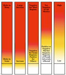
Fifteen scientists from the Intergovernmental Panel on Climate Change (IPCC) have published a controversial graph — which was dropped from the 2007 IPCC report — depicting the risks associated with rising temperatures. Known as the “burning embers” diagram, the color-coded graph shows far more serious environmental and social risks likely to occur with more modest temperature increases than projected in a graph used in the IPCC’s third report, issued in 2001. The revised graph shows a substantial risk to unique and threatened ecosystems, such as tropical glaciers and coral reefs, as temperatures rise 1 to 3 degrees C (1.8 to 5.4 F), as well as a significantly larger risk of extreme weather events. The risk of so-called “large-scale discontinuities” — such as extensive melting of ice sheets in Greenland or West Antarctica — also becomes significant with a 3 degree C temperature increase, a lower threshold than projected in 2001. Writing in the journal Proceedings of the National Academy of Sciences, the 15 scientists said the revised risk assessment reflects recent evidence of significant climate impacts occurring with even modest temperature rises. The burning embers graph was left out of the IPCC’s Fourth Assessment Report in 2007 because some scientists considered it too vague and some governments thought it was alarmist.
`Burning Embers’ GraphRevised to Show Higher Warming Risks
More From E360
-
Cities
In Steel Country, the Fight for Clean Air Faces New Obstacles
-
Solutions
Beyond Lithium: New Battery Tech Starts to Break Through
-
INTERVIEW
What Do We Actually Know About the Microplastics Inside Us?
-
Energy
A Home Battery Revolution Is Reshaping the Power Grid
-
Energy
In East Africa, a Controversial Oil Project Is Poised for Production
-
Climate
A Missing Piece in Climate Models: Nature’s Own Emissions
-
INTERVIEW
An EPA Researcher Details the Agency’s Assault on Science
-
Oceans
Efforts to Save Kelp Forests from Ocean Warming Are Ramping Up
-
Biodiversity
Pollution Is Changing the Smells of Nature, With Risks for Wildlife
-
Oceans
Supertrawlers Are Taking Antarctic Krill That Whales Depend On
-
INTERVIEW
The U.S. Senator Who Won’t Shut Up about Climate Change
-
Energy
A First Among Major Nations, India Is Industrializing With Solar